Colour temperature is one of the quiet forces in lighting design. It bends the mood of a room, alters how materials appear and shapes the emotional quality of a home without a single piece of furniture moving. It works in the background every moment the lights are on, guiding how people feel when they step inside, how clearly they see objects and even how long they linger in a space. Understanding colour temperature deeply is one of the most powerful tools in residential lighting because it lets you tune the atmosphere with extraordinary precision.
The Science Behind Kelvin and Why It Matters
Colour temperature is measured on the Kelvin scale. The number doesn't tell you how hot the globe is but how its light behaves visually. At the low end of the scale, around 2,000-3,000 Kelvin, the light takes on a golden tone similar to candlelight or early evening. As the number increases, the tone shifts into cleaner whites at around 4,000 Kelvin, then moves into crisp, daylight-like brightness at 5,000 Kelvin and above.
What makes Kelvin so important is that humans instinctively interpret these tonal differences. Warm light feels comforting because our brains associate it with sunset, firelight and the natural winding-down phase of the day. Cool white feels energising because it resembles morning daylight, which naturally cues alertness. These associations are built into our circadian biology, and lighting design leverages this instinct to shape ambience in highly nuanced ways.
How Colour Temperature Interacts With Architecture
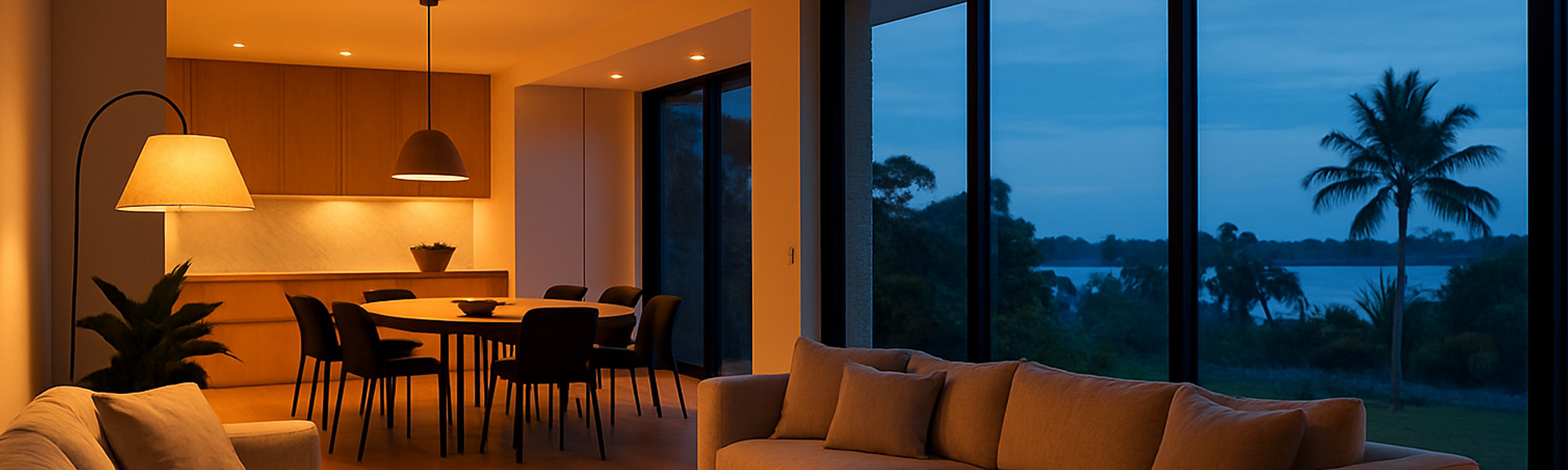
The temperature of light changes the way a building reveals itself. Warm light softens geometry. Edges become less pronounced, and the eye moves more slowly across surfaces. Timber is enriched, textured fabrics look deeper and more tactile, and rooms feel cocooned. Cool white, in contrast, highlights definition. It sharpens corners, increases the clarity of stone and concrete, and gives contemporary interiors a sense of modernity and precision.
Architectural materials each have a preferred range. Black fixtures often look stronger under cooler light, while brass and brushed gold finishes glow under warmer tones. White walls are surprisingly reactive, shifting from creamy to icy depending on the temperature. Even polished floors, tiles and benchtops can look entirely different when the lighting tone changes. Designers often test multiple temperatures in the same space before committing, because the transformation can be unexpectedly dramatic.
The Emotional Impact of Colour Temperature
Colour temperature shapes behaviour as much as it shapes appearance. People gravitate towards warm spaces for relaxation. It is why living rooms, bedrooms and outdoor entertaining areas often favour lower Kelvin values. These tones invite people to unwind, sit back and slow their gestures.
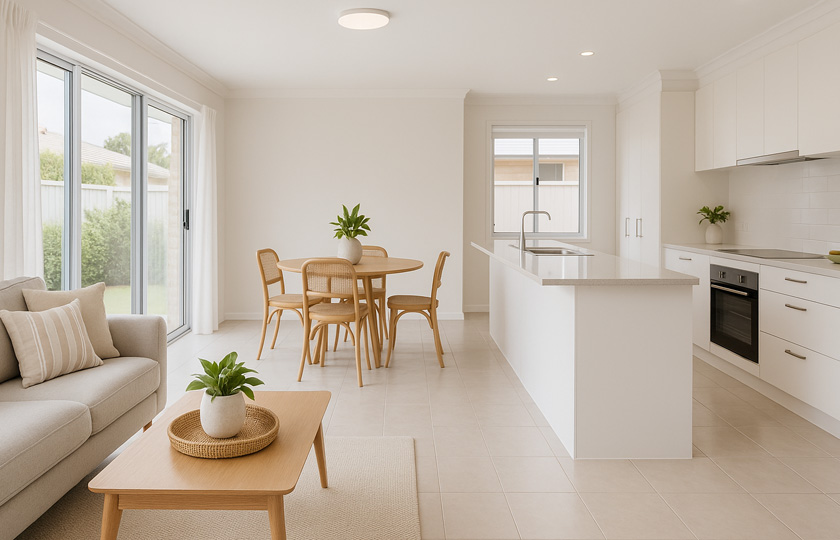
Cooler colour temperatures influence the opposite response. They make detail easier to see, increase alertness and support tasks. A kitchen suddenly feels more efficient under a neutral or cool white. A study becomes a place of focus. Walk-in wardrobes reveal colours more accurately, helping with clothing choices. Bathrooms become clearer and more practical for grooming.
The elegance of colour temperature lies in how subtle these psychological shifts can be. You are not instructing someone to act differently. You are guiding how they feel simply through the type of light they stand in.
The Art of Blending Temperatures in a Home
Contrary to popular belief, lighting does not need to match perfectly throughout an entire house. In fact, thoughtful variation creates depth. A warm foundation layer in living areas can sit comfortably alongside cooler task lighting without causing visual conflict. The key is that each temperature must suit its function.
A home feels more natural when temperature changes follow a logical flow. Moving from a warm lounge to a bright, neutral kitchen feels purposeful because the eye understands the shift. If the transition reverses suddenly or appears unintentional, the lighting can feel disjointed. Designers often frame these transitions around doorways, ceiling height changes or architectural features so the shift in tone feels intuitive.
The Way Surfaces Absorb and Reflect Light
Colour temperature not only affects the light itself but the objects it touches. Different temperatures bring out different qualities in materials. Matte surfaces diffuse light and reduce glare, allowing cooler whites to feel soft rather than clinical. Glossy surfaces amplify reflections, making cooler light seem sharper and more vivid.
Warm tones enrich organic materials. Woven rugs, timber dining tables and linen upholstery gain depth under lower Kelvin values, taking on a luxurious warmth. Under cooler lights, these same materials become visually flatter because their natural hues are subdued.
Stone is particularly sensitive. White marble may appear creamy under warm lighting but reveals its crisp veining under cooler light. Concrete becomes smoother and more architectural under neutral to cool lighting. Paint colours behave the same way, shifting noticeably across colour temperatures in ways homeowners often don't anticipate.
How Colour Temperature Influences Colour Accuracy
Beyond mood, the temperature of light influences how accurately colours appear. Artwork, clothing, makeup and even food can look dramatically different under mismatched lighting. Cool white reveals truer colour because its spectrum sits closer to daylight. It helps identify subtle differences in fabrics, skin tones and materials. Warmer light shifts colours towards amber, making some tones look richer and others less accurate.
This is why designers often specify cooler temperatures for wardrobes, laundries and bathrooms, while preserving warmer tones for relaxation areas. Each choice supports the way the room is used, aligning emotional comfort with practical accuracy.
Dynamic Lighting and the Changing Needs of a Day
Homes rarely have a single lighting requirement. A space can transform multiple times between morning and evening. Neutral or cool white supports daytime activities, making surfaces crisp and detail oriented. As the day softens, warmer light becomes more appropriate, mirroring the natural shift outdoors.
Smart lighting makes this transition effortless. A dining room that functions as a homework zone in the afternoon can return to an intimate, evening glow simply by lowering the temperature. Bedrooms benefit greatly from this adaptability, shifting from fresh morning whites to warm, sleep-friendly tones.
Choosing the Right Temperature for Purpose
Colour temperature is ultimately about intent. If a room is designed for comfort, warmth enhances the sense of safety and ease. If a room is designed for clarity and precision, cooler tones reinforce purpose. The most successful lighting schemes are those where colour temperature supports the mood that the space naturally wants to express.
Good lighting does not need to call attention to itself. When colour temperature is chosen carefully, it blends into the environment and simply feels right. People may not be able to explain why, but they recognise the difference immediately.
You might also like


Disclaimer: Every effort has been made to ensure the accuracy of the information provided, but we make no guarantees regarding its completeness or reliability. The data is presented for general informational purposes only and does not constitute financial, investment, or legal advice. We are not liable for any errors, omissions, or consequences arising from its use. Users should verify details with relevant sources and seek professional advice where appropriate for the most accurate and up-to-date guidance.