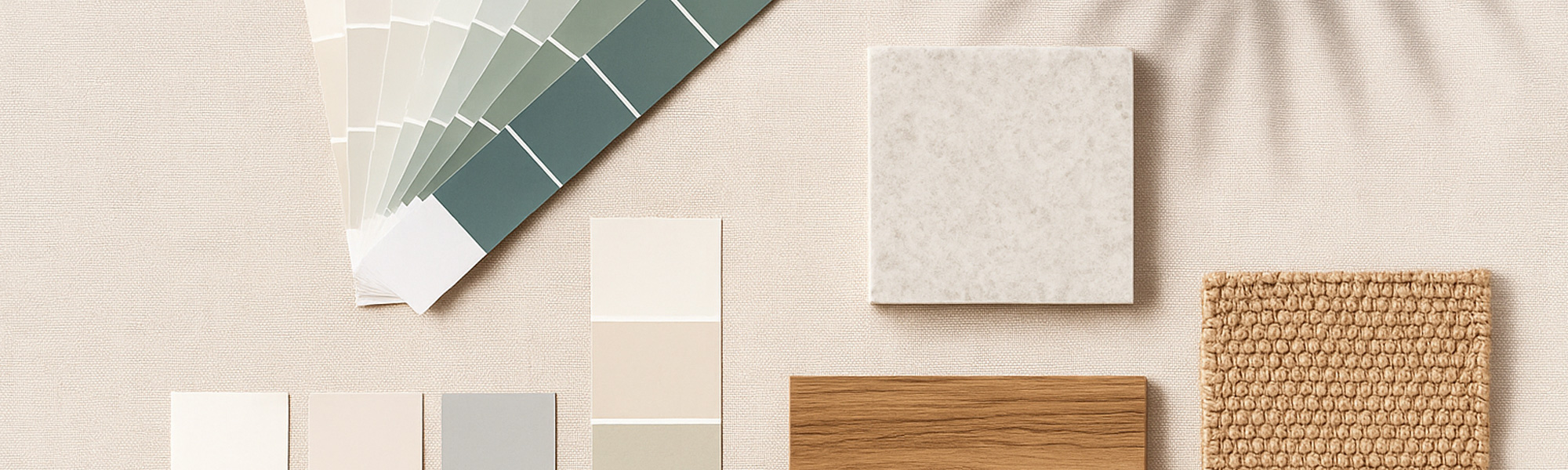
There is a moment during every renovation when the whole project suddenly feels real. It usually happens the day someone opens the fan deck or spreads a collection of colour chips across the kitchen bench. Paint is the decision that sets the tone for everything else. It determines how light moves through the rooms, how warm or cool a home feels, and how the architecture presents itself from the street. It is also the decision that most people agonise over, because choosing colours is never quite as simple as selecting the shade you like.
On the Gold Coast, paint behaves differently. The sunlight is brighter, the humidity is higher and the tropical greenery outside interacts with interior tones in ways that can transform a colour from soothing to overpowering. A shade that looked perfect online or in a cooler southern climate can shift dramatically once it meets a Queensland summer afternoon. This is why so many designers encourage people to slow down, test generously and learn how colours respond to the environment they live in rather than the one they saw on a screen.
Finding Colours That Match the Coastal Light
The first truth about choosing paint colours on the Gold Coast is that light is not neutral here. It carries warmth, intensity and clarity that can amplify undertones in ways that catch people off guard. Soft greys can drift blue or purple. Warm neutrals can suddenly feel yellow. White paints take on personalities of their own. A crisp, gallery style white that feels fresh in a southern home can read harsh or sterile under the brighter Gold Coast sun, while a white with the slightest earthy base can soften a room beautifully.
When designers talk about the Coast's light, they often describe how it plays across surfaces throughout the day. Morning light is soft and gentle. Midday light is powerful and clean. Afternoon light becomes warm and angled. Every colour reacts to this shift, especially in open plan homes with large windows and sliding glass doors where the brightness pours in from several directions at once. For coastal homes that use pale timber, stone and soft furnishings, this amplified light often pairs best with whites or neutrals that have subtle warm undertones. These tones feel calm and natural rather than sharp or reflective.
Understanding the Role of Undertones
Many homeowners think of colours only by their main shade, but what really determines how a room feels is the undertone. This is the hidden base colour that only reveals itself under certain lighting or when placed beside other shades. A grey might be hiding a blue or violet base. A beige might lean pink or yellow. A white might secretly contain green. Once the paint goes up, these undertones become very obvious, especially on a sunny day.
Because the Gold Coast has lush greenery, bright lawns and deep blue pools, undertones can shift depending on the reflections entering the home. A room facing a tropical garden may pick up green and influence the wall colour. A room with a shimmering pool nearby may create soft blue reflections that make cool whites appear cooler than expected. The safest approach is always to test your short-listed colours on multiple walls, leaving them up for several days so you can watch them change from morning to night.
Exterior Colours and the Coastal Environment
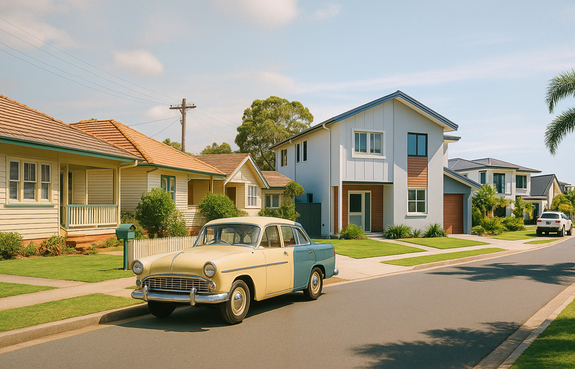
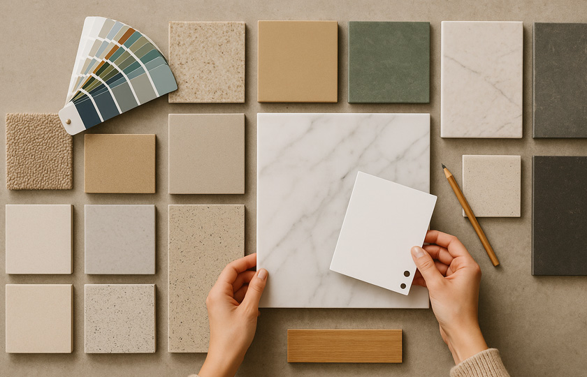
The exterior of a Gold Coast home interacts directly with sunlight, sky reflections and the surrounding landscape. Strong sun exposure can wash out certain colours or make darker paints appear more intense than intended. Rendered homes near the beach often lean toward lighter palettes that resist heat absorption and keep the house looking crisp over time. Homes in leafy acreage areas sometimes suit warmer neutrals or soft earthy hues that complement the natural surroundings.
Timber details, aluminium frames, roof colours and landscaping all influence how an exterior palette comes together. A warm sandy neutral might appear perfect against a modern white roof but feel slightly off next to charcoal or steel. When homeowners imagine the finished look, they often picture a single shade, but the real impact comes from the relationship between colours and materials. This is why exterior colour selections are often tested alongside sample tiles, stone, timber stains and even small pieces of outdoor furniture fabric.
Creating Mood Through Colour
Every room carries a purpose and a natural rhythm, and colour plays a major role in how that rhythm feels. Living rooms often benefit from tones that feel calm during the day and warm at night. Bedrooms thrive with colours that soften the edges of the space and create a sense of retreat. Kitchens and dining areas do well with the kind of clarity that makes surfaces feel clean and inviting.
Warm whites create a sense of softness that works beautifully with coastal interiors. Cool whites introduce freshness and brightness that suit contemporary homes with clean lines. Earthy neutrals bring a grounded feel to large spaces, especially when paired with timber furniture. Pale greens and natural greys can create a serene atmosphere that complements the coastal landscape without dominating it. Even deeper colours have their place on the Coast, especially in media rooms, studies or spaces designed for evening relaxation. Placed strategically, darker tones can create intimacy and drama without overwhelming the home.
The Limitless Variety of Whites
Choosing white paint is often the hardest task of all. People assume white is simple, but it comes in thousands of variations and is particularly sensitive to the Gold Coast light. A white with a warm base can create a buttery softness that feels gentle on the eyes. A white with a cool base can introduce crisp clarity that suits modern styling. A neutral white sits quietly in the middle, adapting to its surroundings.
Interior designers on the Coast often suggest avoiding whites that lean too stark, as the bright sun can make them look sharp rather than elegant. Instead, they recommend whites that carry a tiny hint of warmth. This keeps the home feeling inviting through all seasons and avoids the clinical effect that can appear when too much light bounces off pure white walls.
Why Testing Is Everything
No matter how confident you feel in a sample card, real world testing remains the most important part of choosing paint. A colour that looked perfect under artificial store lighting can behave differently once it meets the shifting natural light in your own home. Even a small difference in orientation can change everything. A colour that feels warm in a north facing living room might feel cooler in a bedroom on the opposite side of the house.
Large sample swatches painted directly onto your walls give you the most accurate sense of how the colour will behave. Watching the colour change throughout the day provides a level of certainty that no small chip can replicate. It also helps prevent the disappointment of finishing a room only to realise the colour feels slightly wrong. Thoughtful testing slows the process down, but it saves time, money and stress in the long run.
Working With the Architecture You Have
A home's design often suggests the palette that will suit it best. High ceilings and open layouts can support lighter tones that enhance the sense of space. Narrow hallways might benefit from warmer shades that create comfort rather than emphasising the dimensions. Older homes with character detailing sometimes look stunning with subtle creamy whites, while newer contemporary builds often shine with crisp neutral palettes.
Exterior architecture influences colour choices too. Homes with deep eaves and shaded facades can handle slightly darker tones without feeling heavy. Homes fully exposed to the sun often look more balanced when the palette stays light and reflective. A good colour scheme works with the architecture, not against it, creating harmony between the structure and the surroundings.
The Power of Restraint
When people renovate, they sometimes feel tempted to mix too many colours, thinking variety will add personality. In practice, a home always feels more elegant when the palette remains cohesive. Subtle variations of the same tone can create depth without visual clutter. Keeping the broader colour story consistent from room to room allows the home to breathe, especially in open layouts where spaces spill into one another.
Restraint doesn't mean avoiding colour. It simply means choosing it with intention. A single accent wall, a deep shade in a study, or a soft pastel in a children's bedroom can elevate the home significantly when placed against a calm foundation.
A Palette That Reflects How You Live
Choosing paint colours is ultimately a personal decision, shaped as much by lifestyle as by trends. Some people want soft, sunlit spaces with gentle whites and natural textures. Others prefer clean contemporary tones that feel fresh and minimal. Many Gold Coast families lean toward colours that evoke calm, comfort and a sense of holiday living year round.
Whatever direction you choose, the most successful palettes are those that make your home feel like a natural extension of the life you want to live. Colour has the power to shape mood, guide the way light moves across each room and bring quiet harmony to your day. When chosen well, it becomes the backdrop to everything that happens inside your home, from everyday family moments to the big occasions that stay with you for years.
You might also like


Disclaimer: Every effort has been made to ensure the accuracy of the information provided, but we make no guarantees regarding its completeness or reliability. The data is presented for general informational purposes only and does not constitute financial, investment, or legal advice. We are not liable for any errors, omissions, or consequences arising from its use. Users should verify details with relevant sources and seek professional advice where appropriate for the most accurate and up-to-date guidance.